After attending the “Time Out” rally on Sunday against further demolition in the Atlantic Yards project without a thorough re-evaluation of everything that has been claimed so far, I left with a great feeling of progress. I am confident that it has become clear to many more people that a lot of the talk and promises coming from Forest City Ratner are lies. But I also think this is in part to an amazing outcry and outreach to the public to inform them of all the social, political and economic faults that lie behind the entire plan. There’s so many amazing sites out there covering this sort of news, from Develop, Don’t Destroy Brooklyn to Atlantic Yards Report, down to individual bloggers like Kingston Lounge, Brit in Brooklyn and Found in Brooklyn.
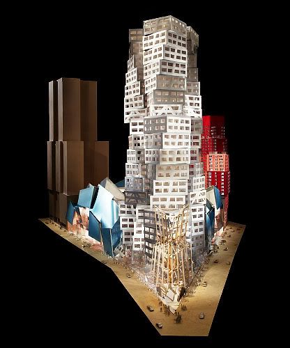
But one thing bothers me- no one has really covered the Frank Gehry side of this entire disaster of a project, nor has it really been formally critiqued from an aesthetic/design standpoint (though No Land Grab did an admirable job looking at Gehry from an environmental standpoint, which encompasses part of my argument). After the release of the new images of what used to be Miss Brooklyn (and is now simply “B1”) I was entertained. I thought some clever artist had come up with a creative visual pun- showing how the “Atlantic Yards” project was falling in on itself, and they’d made a shoddy model with inwardly collapsing structures to signify this.
May 2008 brings yet another redesign of Atlantic Yards, phase one.
I had no idea this wasn’t a joke until I read another few articles featuring the photos and realized this wasn’t a satirical piece.
So, please visit the links above for a very thorough rundown of all the political and economic reasons I feel the current plan for Atlantic Yards is a failure, and why Bruce Ratner is a money-grubbing charlatan. I’d like to address the issue from a side I am yet to really see- why is Frank Gehry, a Canadian-born architect with a long history of poor designs trying to bring a Jenga-like tower into Brooklyn? I work as a graphic designer and went to school for the arts. I absolutely love some modern architecture. I have a great deal of difficulty calling Gehry an architect.
Frank Owen Gehry, born Ephraim Owen Goldberg on February 28, 1929 in Toronto, Canada.
Architecture is defined by efficiently using materials to create structures that fulfill needs. An architect is also an engineer; they must be able to balance aesthetics and beauty with functionality. They must have a knowledge of the space they are about to take on- where it is, what is around it, what their future building or structure will be used for, how best to make it accessible, yet pleasing. A sculptor, by contrast, takes raw materials and creates a piece that can exist in any number of environments. An architect must first consider their environment and create something to exist within it.
Richard Serra’s “Tilted Arc” is a great example. Serra says he created the piece site-specifically, and his project was entirely funded by the National Endowment for the Arts. After his 120 foot long, 12 foot high pieces of steel was placed in the middle of Federal Plaza in New York City, there was a public outcry. Serra intentionally made the courtyard unusable, forcing anyone who worked in the surrounding office buildings to go well out of their way to circumvent it, claiming that this intrusion of space was supposed to force the viewer to be aware of their environment. “The viewer becomes aware of himself and of his movement through the plaza.” After hearings in 1989, the giant sculpture that had cost $175k to build was removed to the tune of an additional $35k.
Frank Gehry seems to think that his works, which I would sooner call sculptures rather than buildings (as a building implies functionality) do not have to exist in accordance with anything but his own vision, and often become alien eyesores amid their surroundings. His ideology would seem as flimsy and haphazard as the models he builds. In 2005, Sydney Pollack filmed a documentary titled “The Sketches of Frank Gehry” which is touted as giving great insight into the way Gehry creates about his deconstructivist forms. I was surprised to find out how vague his ‘sketches’ are, reminiscent of gesture drawings rather than anything even resembling buildings. I was also surprised to find that his method stressed design over function. Every building the man makes seems to start with him playing with paper, foil and popsicle sticks, which would explain why so many of his buildings have required costly alterations once complete to actually make them usable.
A trailer for "Sketches of Frank Gehry."
Suddenly, all the controversy regarding the poor craftsmanship of his buildings– the stark, often jarring disjointed feeling his structures have when finally built in their respective environments– became understandable. The man creates in a vacuum. He plays and fiddles with paper and cardboard and wonders “does this need to be more corrugated?” before he EVER is heard questioning “but will this allow for proper runoff during a torrential downpour?” The movie waxes on about Gehry’s frustration at trying to achieve a painterly surface, his fight against having to use computers or technology, and ultimately portrays him as an arrogant man determined to leave a mark in the architectural community, regardless of cost, client needs or environmental factors.
A review of the construction process of some of Gehry's past projects have revealed his true colors, from his personal manner of conducting himself, to his steadfast resolve never to compromise on his designs. Gehry not only builds unique, ugly buildings that mar neighborhoods, he often fails to construct them well.
The Disney Concert Hall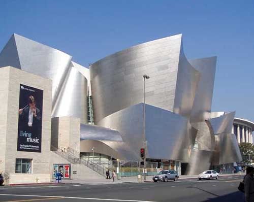
Why any engineer or consultant would ever greenlight a giant parabolic mirror to be built in sunny Los Angeles escapes me, but it was built. Gehry’s $275 million creation for Disney became a giant mirror that in bright sun was focusing the sun’s beams and heating the sidewalk to over 140 degrees F. The structure was blinding people, and was increasing the heat in the neighboring condominiums upwards of 10 degrees. The cost to buff down the plates? An additional $90k after construction was complete on the project. But the outcry mattered little to Gehry, as he reacted to the comments in a 2006 fundraiser in Las Vegas
“I had some bum rap at Disney Hall because of glare. That was 2% of the building had reflective stuff, and some pissed off lady (complained). So the County had to respond. (It took) A couple guys with steel wool and in about an hour and a half they fixed it. But it did appear as one of the 10 engineering disasters in the last ten years---talk about exaggerating. The county did a study of downtown LA that found 5 other buildings that were more reflective, but no one complained about them. So, we got to get more pissed off ladies.”
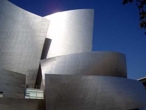
If his chauvinistic side isn’t charming enough, his dismissal of the “couple guys with steel wool” is even better. The project actually took nearly 8 weeks, with the workers who were forced to do the buffing facing searing heat coming off the bright steel plates. Mike Douglass, superintendent of the company hired to buff down the glare said it was a tough job for his men. The Los Angeles Downtown News reported, “The city of Orange-based company usually works on reflective material before it is attached to a building. Because taking the stainless steel off the oddly shaped structure wasn't an option, Douglas said the job puts his workers in rather precarious positions.”
Case Western Reserve
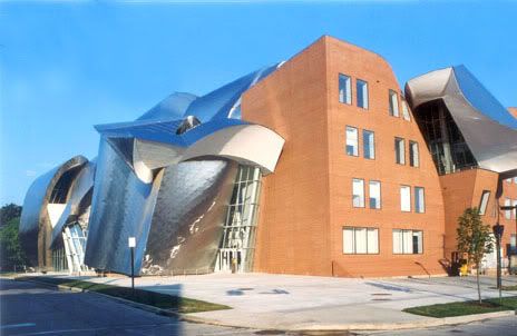
Case Western's Peter Lewis Building
Not only do Gehry’s buildings fail to mesh into the existing environment around them, their budgets are infamous for ballooning out of proportion. When Case Western Reserve wanted to build a new building for their management school, they had a budget of $25 million, but when Gehry was brought in, the university decided to spend $40 million. It was a matter of weeks before the new Weatherhead building was being expected to cost $61.7-million, and there was difficulty in even finding a contractor who wanted to take on Gehry’s absurdist designs. The Chronicle for Higher Education reported:
High demand for construction companies in Cleveland -- complicated by the unconventional elements of the building's design -- also contributed to the hefty price tag. "Everyone expected people to line up to build a Frank Gehry building," Mr. Cameron says. "Instead, we got comments like the one we got from a steel contractor, who said, 'Look, we can build a bunch of square boxes and earn the same $20-million that it will cost to build your building. But we can do those in six months, and it will take two years to do your building.'”
The funds to feed the bloated budget were raised and a contractor was found to create the center, which after $62 million was completed. And when winter came, students were avoiding giant sheets of ice falling off the roof. And uncompromising about his designs as he seems to be, no doubt Gehry loves the contrast of safety blockades stretched alongside his giant sculpture. “The university ordered barricades erected on the sidewalk to keep pedestrians away after the first big snow of the season produced something like an avalanche off the roof," said J.B. Silvers, associate dean for resource management and planning.
MIT Strata Center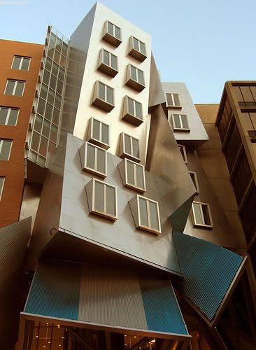
The most recent Gehry disaster comes to us from Massachusetts, where MIT filed a suit against Frank Gehry and a construction company in November, 2007, claiming '“design and construction failures” in the institute’s $300 million Stata Center resulted in pervasive leaks, cracks and drainage problems that have required costly repairs.”' In the winter, similar to Case Western’s problems, snow slides off roofs and blocks emergency exits.
Gehry once said of the building that it, “looks like a party of drunken robots got together to celebrate.” Is the revamp to Miss Brooklyn supposed to look like an orgy between Legos and Jenga?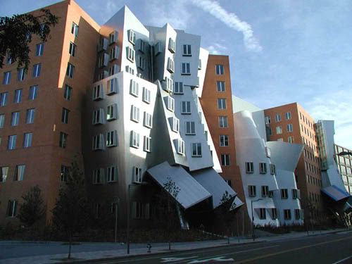
After paying an outside contractor over $1.5 million to repair the crumbling robots, with professors and students alike complaining of how ineffectual and unusable the space was, MIT is suing for an unspecified amount. While they put the blame on Gehry and the construction company that took on the project for doing a poor job, Gehry is countering with an argument that the poor construction is a result of “value engineering” where he accuses the clients of being cheap and leaving out intrinsic parts of his design (funny, seeing as the final Strata center still ballooned $100-million OVER initial predicted costs). He also seems to imply that by the very nature of his outlandish, haphazard designs, of course some things are going to go wrong, and that burden is on the heads of those who hire him. “’These things are complicated,’ he said, ‘and they involved a lot of people, and you never quite know where they went wrong. A building goes together with seven billion pieces of connective tissue. The chances of it getting done ever without something colliding or some misstep are small.’”
Robert Campbell, an architect who is also critic for the Boston Globe seems to agree with Gehry's line of thinking. “"Because he's so daring, you figure you've got to be daring, too, if you're a client," Campbell said. "You know if you hire Frank Gehry there are going to be new kinds of problems." But he said clients accept the risks because "they'll get a building like no other building."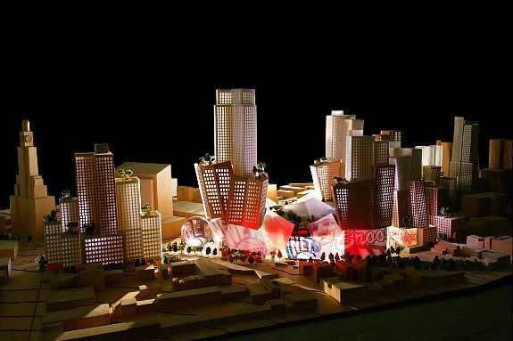
Atlantic Yards, as proposed in 2005
So what sort of faith are we supposed to have in Miss Brooklyn/B1/Jenga Towers? We’ve been misled from the beginning- Forest City Ratner falsely claimed Gehry was from Brooklyn (he’s Canadian) in a bid to win public accolade, budgets have been blown up for the project from the beginning (the publicly funded arena which had started at $435 million , to $647 million last year, is now hovering around a healthy $950 million) and while subsidized housing is being scaled back, at least we’ll still have hoops!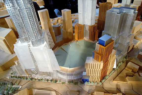
Atlantic Yards, as revised in 2006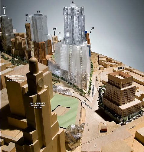
Atlantic Yards, as revised in 2006- second view
“B1” is a monstrosity- it looks like a child was building a diorama for a school project when someone bumped into the table before glue set. How the public is even supposed to tell what is what amazes me- I have a trained eye and I can’t make out what the mass of toothpicks at the base of the structure is. I am insulted that Gehry is attempting to use vapid, hollow artist statements to justify a design that he clearly wasn’t expecting to have to defend.
Revised 2007 Atlantic Yards proposal, now without Miss Brooklyn and "B1" in its place.
Gehry's defense of the red and pink horror (B2) that towers beside the gold cardboard-box was one of the most patronizing statements I’ve heard issued from the FCR/Gehry camp. The pink and red is supposedly there to “speak to the residential fabric of the neighborhood.” And we, as Brooklynites, are not supposed to know any better, because clearly we do not understand art, and this is great; the man understands our residential fabric! Clearly he understands it better than myself, because last time I looked around the Atlantic Yards footprint, I saw brownstones, row houses, limestone and granite facades and accents. But then again, I’m not even sure if Frank Gehry has even been in Brooklyn. Much has already been written about how Gehry's proposed buildings clash with everything that currently exists in the surrounding neighborhood. I really can’t quite figure out how metallic blue, pink, red, silver, toothpicks, gold and a structure that looks like it barely survived an earthquake speak to Brooklyn’s residential fabric. Apparently I am not the only one who is wondering about this.
But the good news is the new AY design is “more festive” than Miss Brooklyn was. Maybe festivity will get you an anchor tenant this time! But I severely doubt it, because while Forest City Ratner is looking to get $4 billion to complete its Atlantic Yards project, much of which is subsidized funding- for just $49.88 , I can get a bunch of my friends together and we too, if only for an afternoon, can pretend to be architects. And fortunately for Gehry, they even ship to Canada.
Frank 0. Gehry & Associates Inc
1520-B Cloverfield Boulevard Santa Monica, CA 90404 USA
tel 310 828 6088 fax 310 828 2098

13 comments:
I feel for Brooklyn, and the people who eventually will inhabit Miss Brooklyn.
On Calatrava: http://www.human-assisted.info/2007/11/bilbao-1-calatrava-0.html
On Gehry's Stata Centre: http://www.human-assisted.info/2007/11/garcia-gets-bim.html
Things like these make one feel good about automating architectural building design.
great piece.
the new neW nEW NEW gehry design is best described by alluding to his MIT drunken robots. The new Building One nee "Miss Brooklyn" appears to be the morning after robot poop and robot upchuck.
Excellent analysis.
Not only is Gehry's design a disaster when considered in context of the neighborhood, it's a disaster in terms of its own, intrinsic aesthetics - it lacks anything resembling internal cohesions, looking more like a group of children got together, each designed a lego toy, and then their proud parents placed all the toys onto the same table.
I very much doubt that much of this will ever get built at this point, but if it does, Ratner deserves whatever structural failures he gets - and there will certainly be some, in a Gehry project that size.
With Gehry's dismissal of his critics, and with his stature in the community, one wonders what unspoken flaws have been found in other structures he's designed...
Like Abstract art, once the 'joke' gets old, or the 'novelty' wears off, what' you're left with is an eyesore.
How anyone can think of building such expensive, quickly dated funtion-less buildings in an age of expsensive oil and environemental concerns is beyond me...oh did I mention security? Apparently, post 9-11 that's not a concern.
VERY impressive research, opinion and analysis. This guy has an ego the size of Canada. At one point he even claimed to be born in Brooklyn.
To subject people that actually live (or if this gets built who will be left?) in this area to this complex built by Lego borders on megalomania.
Thanks for this great piece. Your original reaction was the right one: This design is a joke that will hopefully never become a joke on Brookyn. And Gehry, who reportedly thinks developer Bruce Ratner is a hack (how perceptive!) has indeed found a way to visualize implosion.
Here are a couple of essays I wrote in 2006 about the Atlantic Yards that are quite apropos to the current discussion:
On Gehry's use of computer-assisted design software, which is intended to subordinate the building trades to the architect:
http://www.stuartschrader.com/blog/?p=6
On, among other things, high-brow criticism of the project's opponents, whose take on the architecture supposedly embodies regressive politics:
http://www.stuartschrader.com/blog/?p=11
As per the latter essay, IMO, arguing that Gehry's architecture looks like the work of children or is mere novelty could provide fodder for the project's "high-brow" supporters (however dwindling in number they may be) to claim that the opposition includes philistines who don't know great, innovative, radical aesthetics when they see it.
Stuart- thank you for bringing up the points you did, especially those regarding how the layman's view of "Gehry=crap" can readily be dismissed as a philistine-esque point of view. I don't want to hurt our argument by over-simplifying things, and certainly know how easy it is to do so...
But that was exactly the point of view I wanted to encapsulate in a fleshed out, well articulated and properly researched argument. To those who would still argue against his designs looking like the haphazard renderings of pre-school craftime, you cannot argue with the fact that his structures are poorly constructed and costly, while 'ugly' remains relative. One cannot dismiss the fact that Gehry's character, from his beloved 'ego trip' to easily dismissal of a 'pissed off woman' makes him rather... unlikeable.
So thank you for linking to your articles, and you make some very valid points. I tried not to approach my analysis from a flat, uneducated viewpoint. I've had an amazing bout of discussions over the years, throughout college and onto into the workplace, with various professionals in art, design and architecture fields on the merits of types of 'art' that are often dismissed as being too contemporary, strange, weighted with principle of aesthetics, etc (Duchamp has always been a favorite.)
But this also brings me full circle to where an architect has an entirely different set of criteron and factors to take into consideration and to answer to that an artist does not.
That being said, I am still attempting to arrange a Frank Gehry Arts and Crafts day by the end of the month.
(and a big thank you to everyone who has contributed in the comments/discussion for keeping things civil.)
The new designs are truly hideous. Why should we be surprised after seeing the previous ugly cheap-looking FCR efforts nearby, Atlantic Center, Atlantic Terminal, and the big box stores across the street? These buildings reek of disdain for the neighborhood and its residents, and the new "improved" Gehry designs just follow the old FCR pattern, although at much higher cost.
Thank you for a superb article. Mr. Gehry and Mr. Ratner seem to share such enormous egos and seem to subcribe to some perverted notion of noblesse oblige, insofar as they truly believe that they are "doing good" to Brooklynites?? Or simply that they will inflict their egos upon the public, and public be damned - like it or not, they know what is good for us - and what about Albany and NYC politicians? They too should be ousted. How out of touch with reality, community, historical context, community awareness, environmental concerns, global warming (??)-more cars, pollution, (no 'green building' aspects), aged infrastructure in Bklyn - 150 yr old bridges, old subway systems..to hold tens of thousands MORE people..are they Nuts?? Not to mention that the sewers can't take it either...on and on. This is like some bad joke when downtown Brooklyn and surrounding neighborhoods had stuggled for so long to get better, bring people back, renovate older buildings, build pocket parks, to have FCR et al. arrive with a sledge hammer with Albany and Bloomberg's blessing is horrible. They know little if anything about the history of Brooklyn and could care less. Build blight, rape the NY taxpayers, get as much free money as possible from Government and then pat yourself on the back for being so very clever. There will be a warm place waiting for all of these people down the line. You can count on it.
Hey..I met you at the Blogfest. Great photos, especially Admirals Row & Creedmore. If you ever make it out to the island check out Pilgrim State.
i really appreciate your works because they all have free shapes that not restrained of traditional architecture.i also very much like holl's project. what his are different from yours is his have a more abvious spacial shape.
oh my god you're an idiot! astonishing.
Post a Comment